Colour isn’t just an afterthought in interior design—it is the heartbeat of a room. It is a powerful tool that can significantly impact the look and feel of a home. Whether you are redesigning a single room or planning a new space from scratch, selecting the right palette is the key to creating an environment that feels cohesive, inviting, and uniquely yours.
In this guide, we will dive deep into why colour is crucial, explore the psychology behind every major hue, and provide actionable strategies to master your home’s aesthetic.
Colour is more than just a visual experience; it is an emotional one. It sets the tone, influences our mood, and even alters how we perceive physical space.
1. Mood Setting
Colours have a profound impact on human behaviour. A room isn't just seen; it is felt.
Relaxation: Blues and greens are biologically linked to calmness (think sky and nature), making them perfect for decompression zones.
Energy: Warm colours like reds and oranges raise our energy levels and stimulate conversation.
Sophistication: Neutrals provide a sense of order, calm, and elegance.
2. Space Perception
Did you know paint can change the perceived size of a room?
Light Colours: These reflect light, making small rooms feel expansive, airy, and open.
Darker Shades: These absorb light. While they can make a room feel smaller, they also add immense warmth, intimacy, and coziness, ideal for large, cavernous spaces or media rooms.
3. Personality Expression
Your home is a reflection of you. Whether you prefer the bold drama of high-contrast hues or the soft whisper of muted pastels, your colour palette tells your story.
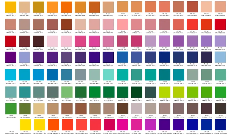
Understanding Colour Psychology—the study of how hues affect behaviour—is essential before buying that first can of paint. Here is exactly what happens when you introduce specific colours into your space.
Red: Passion and Energy
Red is the most intense colour emotionally. It stimulates the senses and can actually raise blood pressure and heart rate.
Best For: Dining rooms (it stimulates appetite) and living areas where you want high energy and conversation.
Caution: It can be too stimulating for bedrooms where the goal is rest.
Blue: Calm and Serenity
Blue is the antidote to red. It lowers blood pressure and slows respiration and heart rate. It is considered intellectual and soothing.
Best For: Bedrooms and bathrooms. Deep navy can also add authority and focus to a home office.
Caution: Pastel blues can look "chilly" in rooms with little natural light.
Green: Nature and Balance
Green is the most restful colour for the human eye. Combining the refreshing quality of blue and the cheerfulness of yellow, it relieves stress.
Best For: Almost any room. It promotes togetherness in living rooms and focus in home offices.
Caution: Be careful with yellow-greens in bathrooms, as they can reflect poorly on skin tones.
Yellow: Happiness and Optimism
Yellow captures the joy of sunshine. It communicates happiness and is an expansive, welcoming colour.
Best For: Kitchens, dining areas, and north-facing rooms that need warmth.
Caution: Yellow is the hardest colour for the eye to process. Used in large quantities, it can trigger frustration. It is best used as a soft tint or an accent.
Purple: Luxury and Creativity
Historically associated with royalty, purple implies wealth and sophistication. It also has a spiritual and creative quality.
Best For: Creative spaces or as an accent in a living room to add depth. Lighter versions (lilac/lavender) are restful for bedrooms.
Caution: Dark purple can be overpowering; ensure you have adequate lighting.
Neutrals (White, Gray, Black)
The backbone of design.
White: Signifies purity and cleanliness. It creates a blank canvas.
Gray: The ultimate chameleon. It can be warm (beige-gray) or cool (blue-gray) and brings a modern, sleek feel.
Black: Used for elegance and drama. It grounds a room and makes other colours pop.
How to Build Your Palette: The Rules of the Trade
Selecting a palette can feel daunting, but professional designers use specific formulas to ensure success.
1. The 60-30-10 Rule
This is the "Golden Rule" of interior design. It helps you achieve balance without doing any math.
60% Dominant Colour: This is your base. It covers the walls and large furniture pieces (like a sofa or rug). It anchors the space.
30% Secondary Colour: This provides contrast. Use it for curtains, painted furniture, or accent chairs. It should support the dominant colour but look different enough to set the furniture apart.
10% Accent Colour: This is the jewelry of the room. Use it for throw pillows, art, lamps, or floral arrangements.
2. Understand Colour Temperature
Warm Colour(Red, Orange, Yellow): These advance toward the eye, making large rooms feel cozier. They mimic sunlight and fire.
Cool Colour(Blue, Green, Purple): These recede from the eye, making small rooms feel larger. They mimic water and sky.
3. Define the Colour Scheme
Monochromatic: Variations of a single hue (e.g., Sky Blue, Navy, and Royal Blue). This creates a clean, sophisticated look.
Analogous: Colours that sit next to each other on the colour wheel (e.g., Blue and Green). This is serene and harmonious.
Complementary: Colours opposite each other on the wheel (e.g., Blue and Orange). This creates high contrast and high energy.
Practical Tips for Implementation
Once you have your colours, how do you put them into the room?
Start with a Focal Point: Never start with the paint colour. Paint can be mixed to match anything. Start with a rug, a piece of art, or a patterned fabric you love. Pull your palette from that item.
Test Your Lighting Light changes everything.
Natural Light: Shows the truest colour.
Incandescent Bulbs: Bring out warm tones (yellows/reds).
Fluorescent Bulbs: Cast a sharp blue tone.
Tip: Always test paint samples on your wall and look at them in the morning, afternoon, and night before committing.
Use Texture to Add Depth: If you are using a neutral or monochromatic scheme, the room can fall flat. Use texture to replace colour variety. Pair matte walls with velvet sofas, silk curtains, or woven rugs to keep the eye interested.
Consider the Flow: You don't need the same colour in every room, but the house should feel connected. If you have a blue living room, perhaps use that same blue as an accent colour in the adjacent dining room to create "rhythm" and unity.
Common Mistakes to Avoid
Ignoring the Floor: Your floor is a huge surface area. If you have warm honey-wood floors, a cool gray wall might clash.
Trends over Taste: "Colour of the Year" is great for marketing, but you have to live in the house. Choose what resonates with you emotionally.
Overwhelming the Space: Too many bold colours can feel chaotic. If you love bold colours, use them as your 30% or 10%, not your 60%.
In conclusion, the right colour palette can breathe new life into your home, making it feel inviting, harmonious, and uniquely yours. By understanding the psychological impact of different hues and using tools like the 60-30-10 rule, you can stop guessing and start designing with confidence.
Go ahead—experiment, be bold, and let your creativity shine through the colours you choose!